Legacy Custom Apps Style Guide
We're thrilled to announce that our new App Developer Platform is now available to all customers. We highly encourage all new apps to be built on the platform to take advantage of its expanded capabilities.
All existing legacy custom apps will continue to function as before. If you'd like to use the legacy framework to install a legacy custom app, click here. If you create a legacy custom app, we'd love to hear why you chose legacy over the new app platform. Send us feedback here.
There are several great ways to format the HTML of your App so that it visually complements the rest of the web app. Inline CSS, HTML not documented here, and JavaScript will be stripped out, but it’s still possible to add a bit of style to your HTML. We do not support interactive elements other than links. Note: please visit the following link for the styleguide v1.
Basics
Let’s start with the example App:
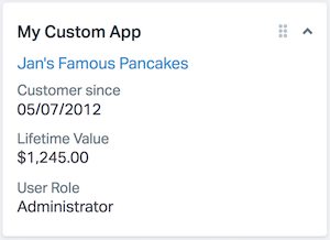
The HTML for this App would be as follows:
<h4><a href="[URL here]">Jan's Famous Pancakes</a></h4>
<ul class="c-sb-list c-sb-list--two-line">
  <li class="c-sb-list-item">
    <span class="c-sb-list-item__label">
      Customer since
      <span class="c-sb-list-item__text">05/07/2012</span>
    </span>
  </li>
  <li class="c-sb-list-item">
    <span class="c-sb-list-item__label">
      Lifetime Value
      <span class="c-sb-list-item__text">$1,245.00</span>
    </span>
  </li>
  <li class="c-sb-list-item">
    <span class="c-sb-list-item__label">
      User Role
      <span class="c-sb-list-item__text">Administrator</span>
    </span>
  </li>
</ul>
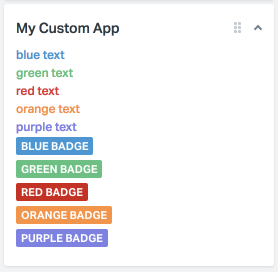
The following classes can be used to format text:
| Class | Value |
|---|---|
| noMargin | margin:0; |
| ul.unstyled, ol.unstyled | list-style:none; margin-left:0; |
| .divider | block-level 1px border with spacing on top/bottom |
| .muted | gray text color |
| .blue | blue text color |
| .green | green text color |
| .red | red text color |
| .orange | orange text color |
| .purple | purple text color |
| .strike | strike through text |
| span.badge | gray badge |
| span.badge.blue | blue badge |
| span.badge.green | green badge |
| span.badge.red | red badge |
| span.badge.orange | orange badge |
| span.badge.purple | purple badge |
Collapsible Content
You can store some content in a collapsible area to save space, then expand/collapse it as needed. The example below shows two collapsible content areas. When you click the link, the content expands or collapses:

Here’s the HTML:
<div class="c-sb-section c-sb-section--toggle">
  <div class="c-sb-section__title js-sb-toggle">
    Profile <i class="caret sb-caret"></i>
  </div>
  <div class="c-sb-section__body">
    <ul class="unstyled">
      <li><strong>Jan's Famous Cupcakes</strong></li>
      <li>$1,245 lifetime value</li>
      <li>Customer since: 05/07/12</li>
      <li>10 orders</li>
    </ul>
  </div>
</div>
<div class="c-sb-section c-sb-section--toggle">
  <div class="c-sb-section__title js-sb-toggle">
    <i class="icon-cart icon-sb"></i> Orders (1)
    <i class="caret sb-caret"></i>
  </div>
  <div class="c-sb-section__body">
    <ul class="unstyled">
      <li><span class="muted">12/14/12</span> - $195 (<a href="#">#12345</a>)</li>
      <li><span class="muted">08/10/12</span> - $74 (<a href="#">#12112</a>)</li>
      <li><span class="muted">05/07/12</span> - $112 (<a href="#">#11342</a>)</li>
    </ul>
  </div>
</div>
We suggest using the arrow icon for collapsible content, as it will rotate based on the state. The arrow faces down when the content is expanded and faces to the right when collapsed.
If you’d like to nest toggleGroups, simply add the .nested class so the arrow icon will rotate accordingly.
Icons
Simply add the .muted class to any of these icons to lighten them up a bit.
| Icon | Code |
|---|---|
<i class="icon-flag"></i> |
|
<i class="icon-star"></i> |
|
<i class="icon-cart"></i> |
|
<i class="icon-person"></i> |
|
<i class="icon-tag"></i> |
|
<i class="icon-gear"></i> |
|
<i class="icon-cash"></i> |
|
<i class="icon-case"></i> |
|
<i class="icon-arrow"></i> |
|
<i class="icon-check"></i> |
|
<i class="icon-pointer"></i> |
|
<i class="icon-cloud"></i> |
|
<i class="icon-folder"></i> |
|
<i class="icon-doc"></i> |
|
<i class="icon-search"></i> |
|
<i class="icon-globe"></i> |
Advanced Styling
Be sure to checkout our sidebar app components to further style your custom apps with other supported classes.